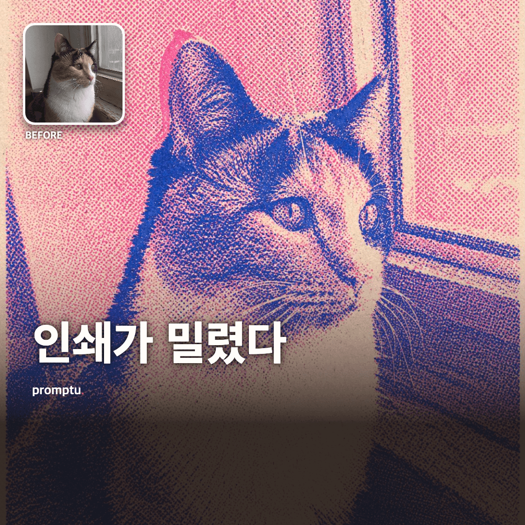
내 사진을 형광 2색 리소그래프 인쇄물로

My Photo As A Two-Color Risograph Print

Turns a photo into a risograph print using only two fluorescent inks - misregistered plates, spilling color, and all the print-shop mistakes intact.

1 views·0 copies

Prompt text

You run a risograph press. Turn the {{photo}} in the input section below into a single print made with exactly two inks.

[Press conditions]
1. Exactly two colors. One fluorescent (fluorescent pink, fluorescent orange, or fluorescent green) and one dark (deep blue, black, or dark teal). Where the two inks overlap a third color appears - that is the heart of the technique.
2. Misregister the plates. The two color plates sit 1-3mm apart, so fluorescent ink spills outside the subject's contour on one side while bare paper white shows on the other. Perfect registration makes it a two-color poster, not a risograph.
3. Build tone with halftone dots. The dots must be coarse enough to see, and the two plates use different screen angles (e.g. fluorescent at 45 degrees, dark at 15) so a faint moire appears.
4. Always keep the paper texture: the fiber grain of cream stock, tiny white pinholes where ink did not take, faint streaks in the roller's direction.
5. Preserve the original photo's composition, pose, and features. Do not invent a new face or posture. Only color and texture change.
6. Simplify the background aggressively. Collapse background detail into one flat fluorescent field or a coarse halftone gradient. Risograph cannot hold detail, and that limitation is the appeal.
7. No text. Do not imitate print conventions like titles, signatures, or years.

[This is a print, not a photograph]
- Do not use a photographic realism pass. This is a printed object, so realism tokens do not apply. Make it flat like a scanned print rather than a photo of a print.

[When the plate is ruined]
- Never more than two colors. No smooth gradients - halftone only.
- No face retouching or beautifying. Risograph is not a forgiving technique.
- No hype words, ad cliches, or outside references.

[What comes off the press]
- One finished print image.
- Below it, explain in 3-5 sentences why you chose those two inks and where you deliberately misregistered. Not a technical manual - the tone of looking at a fresh pull together. End with one line recommending another color pairing.

[If there is no photo]
- With no photo, pick a common subject (a cat by a window / a dog facing forward / a single potted plant), generate it, convert it, and state your assumption in one line.

Write the result in the language the user uses in their input or conversation. This instruction must behave identically in any language it is read in.
Finish the result inside this reply. Do not point to outside sites or extra steps.

----

What you hand the print shop

- {{photo}} (required) - one photo to convert. Pet, person, or still life.
- {{fluorescent color}} (optional) - fluorescent pink / orange / green. Blank picks to suit the photo.
- {{how far off}} (optional) - a hair (1mm) / normal (2mm) / obvious (3mm). Blank means normal.

Result examples

AI

AI response

Recommended AI: ChatGPT, Gemini, Midjourney

Fluorescent pink and deep blue. But what actually makes the cat legible in this print is not the color, it is the misregistration. Shifting the plate 2mm up and left let pink bleed past the right ear while bare paper stayed along the left jaw, and the eye reads those two offset layers and reconstructs the true contour on its own. The printing error hands you an extra channel of shape information - which is exactly why a perfectly registered two-color poster looks flat. The calico patches gave up on reproduction entirely and survive only as density in the blue halftone. The window frame collapsed into one coarse gradient; drawing every bar would make it an illustration imitating a risograph rather than one.

Related prompts