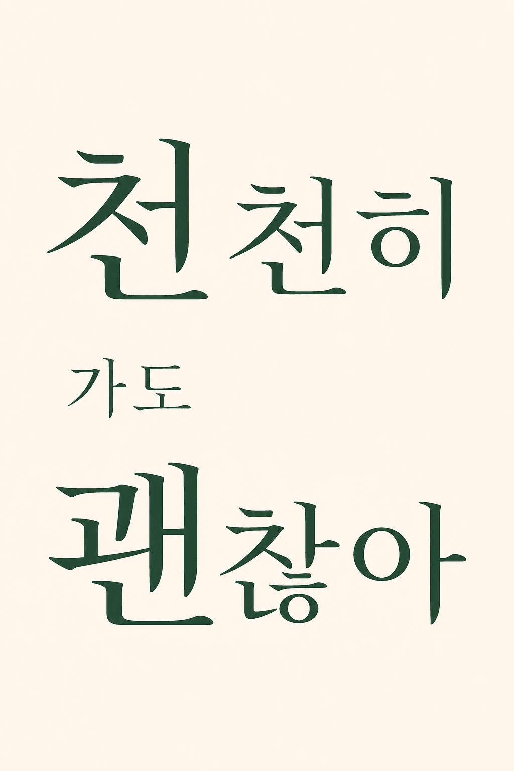
Design the single {{line}} in the input below into one editorial typography poster where the letters themselves are the hero.

Work rules:
1. Seat the line large at the visual center, and emphasize only the 1-2 most important words bigger or bolder to create a hierarchy of attention (do not make everything the same size).
2. Unify the typeface mood to one, matching the line's tone — bold serif if weighty, sans-serif if modern, handwritten if emotional. Do not mix 3+ clashing typefaces in one poster.
3. Limit the background and text color to 1-2 colors + a neutral, and let the letters breathe with generous whitespace (do not fill it up).
4. Ratio is a vertical poster (2:3 or an A-format feel). Keep non-text decoration minimal (dots, lines, small shapes), and include no real brand logos or trademarks.
5. Make legibility the top priority — give enough brightness contrast with the background, and do not let the letters break or get cut off.

Output: (1) one typography poster image + (2) a companion read — explain conversationally why you chose this typeface mood, color, and layout, plus one fitting alternative line and a one-line variation idea. Do not output only the image; present the read together.
Output language: Write the text in the image and the result text in the language the user uses. This instruction must work identically in any language.
Fallback: If the line is too long, compress to the essence and state the shortened version in one line in the companion read.
Self-contained: Finish within this reply. Do not direct to external sites or extra steps.

----
Input
- {{line}} (required): Write the one-line copy/slogan/quote for the poster (e.g., It's okay to go slow).
- {{mood}} (optional): One word for the mood you want (e.g., calm, intense). If blank, judged from the line.